Exploring Large-scale Raster Population Data

Visualizing geospatial population data across multiple scales using Python: global, country, and urban-level data
I have often seen beautiful population maps circulating online; however, I usually got stuck at some technical parts, like visualizing other map segments than shown in the tutorial or turning the large-scale raster data into more computation-friendly vector formats. I overcome some of these shortcomings in this article with a hands-on guide to two primary global population data sources.
It is also important to note that besides their aesthetic value, population data and maps showing them are amongst the most basic information and valuable information one can gather and incorporate for any urban development or location intelligence task. They come in particularly handy in use cases such as planning new amenities, site selection and catchment analysis, estimating the scale of urban products, or profiling different neighborhoods, just to mention a few.
1. Data sources
I am relying on the following two fine-grained population estimate data sources, which you can download the files via the attached links (at the date of the publication):
- The European Commission’s GHSL — Global Human Settlement Layer measures each grid cell’s population level. Find the overall description here and the particular set I used from their 2023 report with a spatial resolution of 100m here.
- WorldPop hub, from where I will take Germany as an example using the constrained individual countries data set at a resolution of 100m. Find the listing here and Germany’s data here.
2. Visualizing the Global Human Settlement Layer
2.1. Import the data!
I first came across with this dataset in the Datashader tutorial of the Architecture Performance. After reproducing their visualization, I hit a few roadblocks by extending it to a global map, which initiated this work, so now I show you the workarounds I found on how to do that!
First, parse the raster file using the xarray package.
import rioxarray

file_path  = "GHS_POP_E2030_GLOBE_R2023A_54009_100_V1_0/GHS_POP_E2030_GLOBE_R2023A_54009_100_V1_0.tif"

data_array = rioxarray.open_rasterio(file_path, chunks=True, lock=False)
data_array
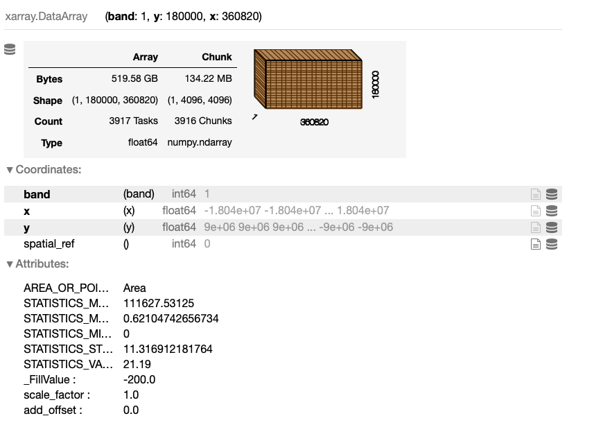
The output of this cell is a detailed description of the data set:
2.2. Visualizing segments of the data
We can already see this is a pretty challenging amount of data for most of the standard laptops. Anyway, let’s try to visualize it using Datashader, a really handy tool for geospatial datasets of this magnitude:
# WARNING: THIS CODE BLOCK WILL MOST LIKELY CAUSE A MEMORY OVERFLOW ERROR

import datashader as ds
import xarray as xr
from colorcet import palette
from datashader import transfer_functions as tf

# prepare to plot
data_array_p = xr.DataArray(data_array)[0]
data_array_p = data_array_p.where(data_array_p > 0)
data_array_p = data_array_p.compute()

# get the image size
size = 1200
asp  = data_array_p.shape[0] / data_array_p.shape[1]

# create the data shader canvas
cvs = ds.Canvas(plot_width=size, plot_height=int(asp*size))
raster = cvs.raster(data_array_p)

# draw the image
cmap = palette["fire"]
img = tf.shade(raster, how="eq_hist", cmap=cmap)
img
While this code looks technically OK, my 2021 M1 Macbook Pro with 16GB of RAM gives a miserable memory overflow error. So, let’s crop the image to look into the data! For this, I follow the Architecture Performance and focus on Europe, which I follow for the time being, as it certainly works.
However, the main question I will answer later is how can we visualize the entire globe’s data despite such memory limitations but still using our local machine? Wait for it!
import datashader as ds
import xarray as xr
from colorcet import palette
from datashader import transfer_functions as tf
import numpy as np

# crop the data array
data_array_c = data_array.rio.clip_box(minx=-1_000_000.0, miny=4_250_000.0, maxx=2_500_000.0, maxy=7_750_000.0)
data_array_c = xr.DataArray(data_array_c)

# prepare to plot
data_array_c = xr.DataArray(data_array_c)[0]
data_array_c = data_array_c.where(data_array_c > 0)
data_array_c = data_array_c.compute()
data_array_c = np.flip(data_array_c, 0)

# get the image size
size = 1200
asp  = data_array_c.shape[0] / data_array_c.shape[1]

# create the data shader canvas
cvs = ds.Canvas(plot_width=size, plot_height=int(asp*size))
raster = cvs.raster(data_array_c)

# draw the image
cmap = palette["fire"]
img = tf.shade(raster, how="eq_hist", cmap=cmap)
img = tf.set_background(img, "black")

img
This code block outputs the following visual:
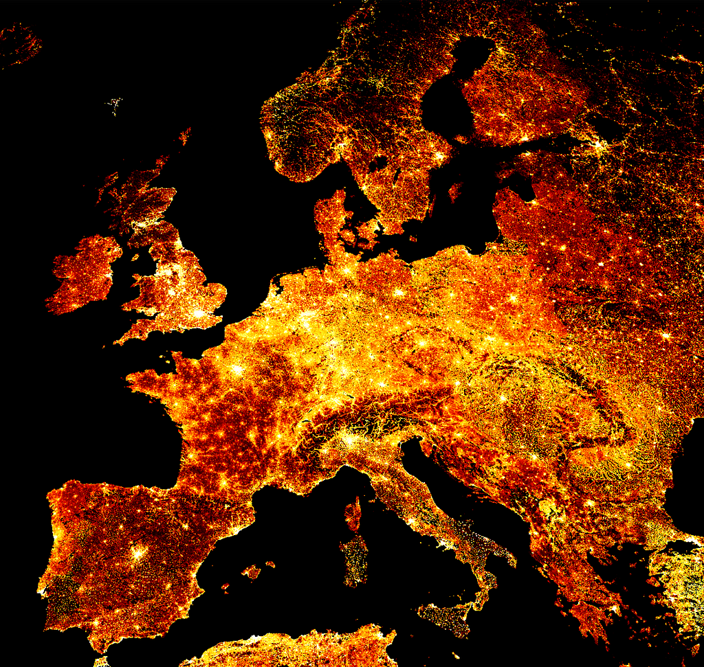
Using the ‘fire’ colormap seems like an industry standard for a good reason; however, if you wish to mix things up, you may find other coloring schemes here and applied below:
# create the data shader canvas
cvs = ds.Canvas(plot_width=size, plot_height=int(asp*size))
raster = cvs.raster(data_array_c)

# draw the image
cmap = palette["bmw"]
img = tf.shade(raster, how="eq_hist", cmap=cmap)
img = tf.set_background(img, "black")

img
This code block outputs the following visual:

2.3. Visualizing the entire globe
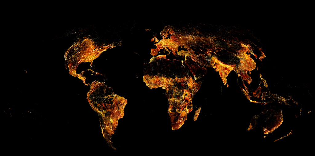
So the data is there, but what if you have a regular computer at hand and still want to visualize the whole world at a resolution of 100m? The workaround I will show you here is relatively simple — I split the entire raster image into about a hundred smaller tiles so that my computer handles them well one by one, then use some image manipulation tricks to merge them into one image file.
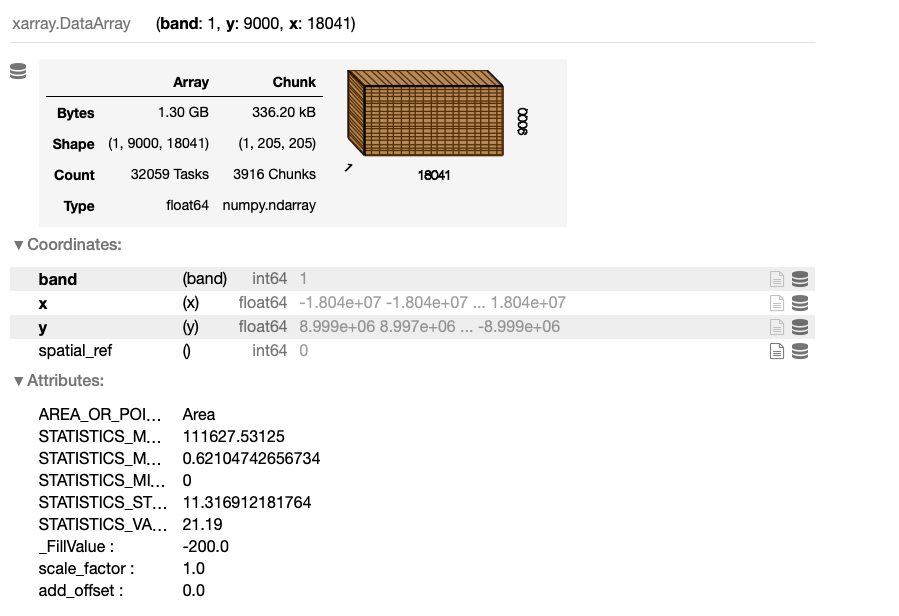
However, before moving on — a quick note. There is also an option to downsample XArray arrays in the following way — however, I couldn’t find an appropriate downscaling that could have handled the whole data set. Additionally, I didn’t want to lose accuracy and wanted to see the entire data set in full glory.
# a quick way to down-sample the data
downsampling_factor = 20

downsampled_data_array = data_array.coarsen(x=downsampling_factor, y=downsampling_factor).mean()
downsampled_data_array
And the output — which is worth contracting to the previously plotted data_array:
To split the whole raster image into grid segments, first, get its boundaries and define N as the step size. Then, create the list of image segment boundaries.
minx = float(data_array.x.min().values)
maxx = float(data_array.x.max().values)
miny = float(data_array.y.min().values)
maxy = float(data_array.y.max().values)

N = 10
xstep = (maxx-minx) / N
ystep = (maxy-miny) / N

xsteps = list(np.arange(minx, maxx, xstep))
ysteps = list(np.arange(miny, maxy, ystep))
Now, iterate over each x and y step and create each image segment, where each image file is named after its position in the original grid. This loop may take a while.
import os
foldout = 'world_map_image_segments'
if not os.path.exists(foldout):
    os.makedirs(foldout)

for idx_x, x_coord in enumerate(xsteps):
    for idx_y, y_coord in enumerate(ysteps):

        if not os.path.exists(foldout+'/'+str(idx_x)+'_'+str(idx_y)+'.png'):

            data_array_c = data_array.rio.clip_box( minx=x_coord,  miny=y_coord,  maxx=x_coord+xstep, maxy=y_coord+ystep)
            data_array_c = xr.DataArray(data_array_c)[0]
            data_array_c = data_array_c.fillna(0)
            data_array_c = data_array_c.where(data_array_c > 0)
            data_array_c = data_array_c.compute()
            data_array_c = np.flip(data_array_c, 0)

            size = 2000
            asp  = data_array_c.shape[0] / data_array_c.shape[1]

            cvs = ds.Canvas(plot_width=size, plot_height=int(asp*size))
            raster = cvs.raster(data_array_c)

            cmap = palette["fire"]
            img = tf.shade(raster, how="eq_hist", cmap=cmap)
            img = tf.set_background(img, "black")

            pil_image = img.to_pil()
            pil_image.save(foldout+'/'+str(idx_x)+'_'+str(idx_y)+ '.png')
            print('SAVED: ', x_coord, y_coord, y_coord+xstep,y_coord+ystep)
Finally, if we have all the image segments, we can assemble them quickly with the following function. For this piece of code, I also asked for some hints from ChatGPT to speed things up, but as usual, it also needed some manual tweaks.
from PIL import Image


def find_dimensions(image_dir):
    max_x = 0
    max_y = 0

    for filename in os.listdir(image_dir):
        if filename.endswith(".png"):
            x, y = map(int, os.path.splitext(filename)[0].split("_"))
            max_x = max(max_x, x)
            max_y = max(max_y, y)

    return max_x + 1, max_y + 1


image_dir = foldout
segment_width = size
segment_height = int(asp*size)


# Determine the dimensions of the large image
large_image_width, large_image_height = find_dimensions(image_dir)

# Create an empty large image (white background)
large_image = Image.new("RGB", (large_image_width * segment_width, large_image_height * segment_height), "black")

# Loop through the individual image segments and paste them into the large image
for filename in sorted(os.listdir(image_dir)):
    if filename.endswith(".png"):
        x, y = map(int, os.path.splitext(filename)[0].split("_"))
        segment_image = Image.open(os.path.join(image_dir, filename))
        x_offset = x * segment_width
        y_offset = large_image_height * segment_height-1*y * segment_height
        large_image.paste(segment_image, (x_offset, y_offset))

# Save the merged large image
large_image.save("global_population_map.png")
And the final result here, the entire globe mapped out:
3. Visualizing and transforming WorldPop data
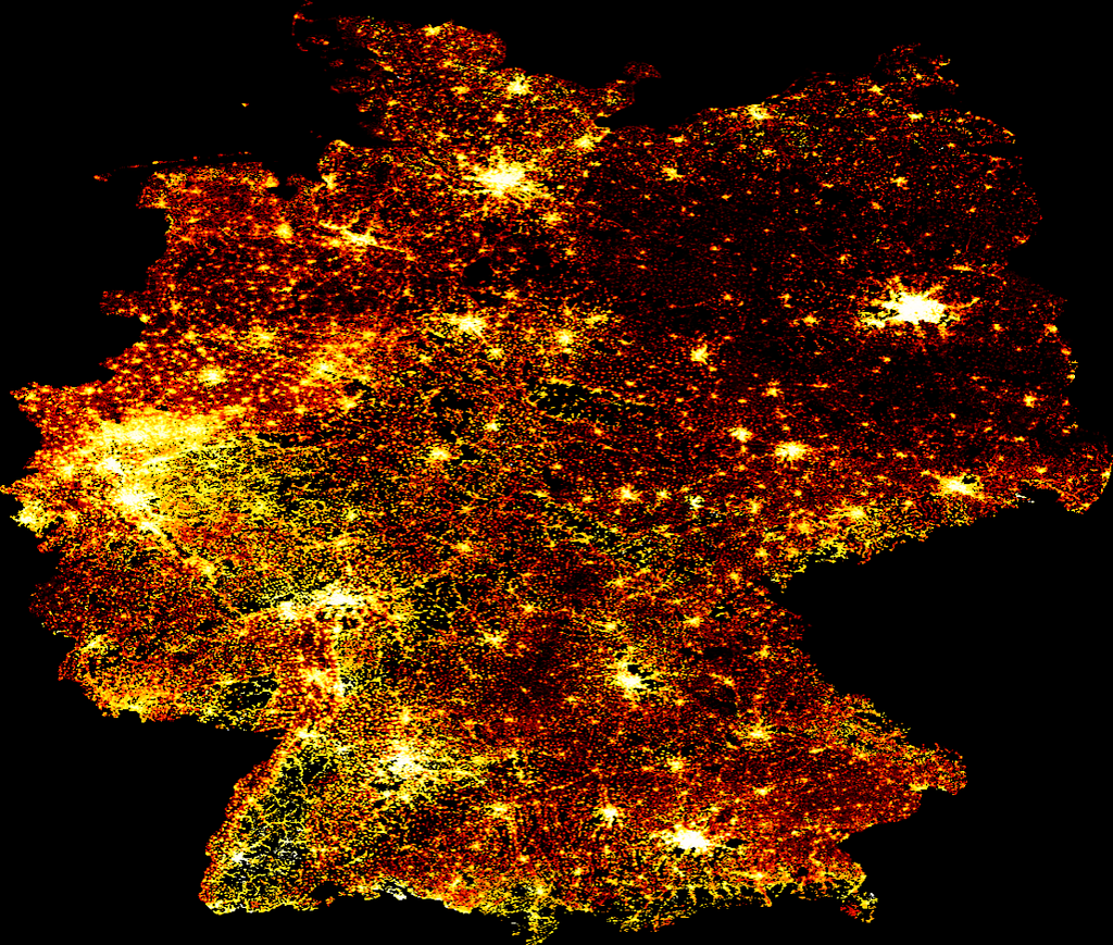
The second data source I would like to show you is the WorldPop population database, which has continents and countries separately at various resolutions. In this example, complementing the previous section’s continent and global levels, here I shoot for the level of countries and cities. For instance, I go with Germany and a resolution of 100m curated in 2020, and also show you how to carve out a city from the whole country and turn it into an easy-to-use vector format using GeoPandas.
3.1. Visualizing WorldPop data
Using the previous methods, we can again quickly visualize this raster file:
# parse the data
data_file = 'deu_ppp_2020_constrained.tif'
data_array = rioxarray.open_rasterio(data_file, chunks=True, lock=False)

# prepare the data
data_array = xr.DataArray(data_array)[0]
data_array = data_array.where(data_array > 0)
data_array = data_array.compute()
data_array = np.flip(data_array, 0)

# get the image size
size = 1200
asp  = data_array.shape[0] / data_array.shape[1]

# create the data shader canvas
cvs = ds.Canvas(plot_width=size, plot_height=int(asp*size))
raster = cvs.raster(data_array)

# draw the image
cmap = palette["fire"]
img = tf.shade(raster, how="eq_hist", cmap=cmap)
img = tf.set_background(img, "black")
img
This code block outputs the following visual:
3.2. Transforming WorldPop data
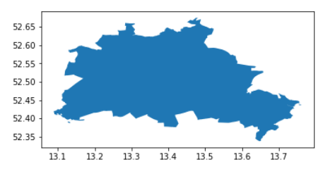
After visualizing the entire planet, the continent of Europe, and the country of Germany, I would like to get more hands-on with the city of Berlin and show you how to transform such raster data into vector format and manipulate it easily with GeoPandas. For this, I access the administrative boundaries of Berlin in a geojson format here.
This admin file contains the boroughs of Berlin, so first, I merge them into the city as a whole.
from shapely.ops import cascaded_union
import geopandas as gpd


admin = gpd.read_file('tufts-berlin-bezirke-boroughs01-geojson.json')
admin = gpd.GeoDataFrame(cascaded_union(admin.geometry.to_list()), columns = ['geometry']).head(1)

admin.plot()
This code block outputs the following visual:
Now turn the xarray into a Pandas DataFrame, extract the geometry information, and build a GeoPandas GeoDataFrame. One way to do this:
import pandas as pd

df_berlin = pd.DataFrame(data_array.to_series(), columns = ['population']).dropna()
Now, build a GeoDataFrame from this, focusing on Berlin:
from shapely.geometry import Point

# find the limiting bounding box for easier coodinate-selection
minx, miny, maxx, maxy = admin.bounds.T[0].to_list()

points = []
population = df_berlin.population.to_list()
indicies   = list(df_berlin.index)

# create Point geometries from the points falling into this bounding box
geodata = []
for ijk, (lon, lat) in enumerate(indicies):
    if minx <= lat <= maxx and miny <= lon <= maxy:
        geodata.append({'geometry' : Point(lat, lon), 'population' : population[ijk]})

# build a GeoDataFrame
gdf_berlin = gpd.GeoDataFrame(geodata)
gdf_berlin = gpd.overlay(gdf_berlin, admin)
Then, visualize the population as vector data:
import matplotlib.pyplot as plt


f, ax = plt.subplots(1,1,figsize=(15,15))

admin.plot(ax=ax, color = 'k', edgecolor = 'orange', linewidth = 3)

gdf_berlin.plot(column = 'population',
                cmap = 'inferno',
                ax=ax,
                alpha = 0.9,
                markersize = 0.25)

ax.axis('off')
f.patch.set_facecolor('black')
This code block outputs the following visual:

Finally, here we have a standard GeoDataFrame with 100m resolution population levels assigned to each point geometry corresponding to each pixel in the raster file.
Summary
In this article, I explored two global population data sets based on various, which estimate population levels by combining various approximation, measurement, and modeling approaches at a remarkable spatial resolution of 100m using raster grids. This type of information is highly valuable for a wide range of applications in urban development and location intelligence, such as infrastructure planning, site selection, neighborhood profiling, and more. From the technical side, I showed examples at three spatial levels, covering the entire globe, then zooming in to countries, and finally, cities. While the methodology can handle even smaller resolutions, this all happened on a single laptop using powerful Python libraries like Xarray, DataShader, and GeoPandas.
Exploring Large-scale Raster Population Data was originally published in Towards Data Science on Medium, where people are continuing the conversation by highlighting and responding to this story.

