
Visualizing and interpreting decision trees
Posted by Terence Parr, Google
Decision trees are the fundamental building block of Gradient Boosted Trees and Random Forests, the two most popular machine learning models for tabular data. To learn how decision trees work and how to interpret your models, visualization is essential.
TensorFlow recently published a new tutorial that shows how to use dtreeviz, a state-of-the-art visualization library, to visualize and interpret TensorFlow Decision Forest Trees.
The dtreeviz library, first released in 2018, is now the most popular visualization library for decision trees. The library is constantly being updated and improved, and there is a large community of users who can provide support and answer questions. There is a helpful YouTube video and article on the design of dtreeviz.
Let’s demonstrate how to use dtreeviz to interpret decision tree predictions.
At a basic level, a decision tree is a machine learning model that learns the relationship between observations and target values by examining and condensing training data into a binary tree. Each leaf in the decision tree is responsible for making a specific prediction. For regression trees, the prediction is a value, such as price. For classifier trees, the prediction is a target category, such as cancer or not-cancer.
Any path from the root of the decision tree to a specific leaf predictor passes through a series of (internal) decision nodes. Each decision node compares a single feature’s value with a specific split point value learned during training. Making a prediction means walking from the root down the tree, comparing feature values, until we reach a leaf. Consider the following simple decision tree that tries to classify animals based upon two features, the number of legs and the number of eyes.
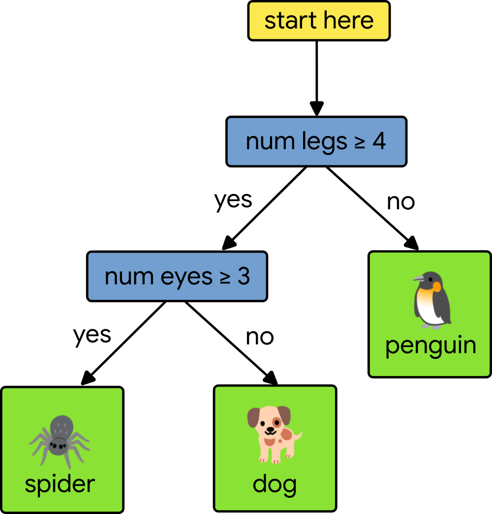 |
Let’s say that our test animal has four legs and two eyes. To classify the test animal, we start at the root of the tree and compare our test animal’s number of legs to four. Since the number of legs is equal to four, we move to the left. Next, we test the number of eyes to three. Since our test animal only has two eyes, we move to the right and arrive at a leaf node, which gives us a prediction of dog. To learn more, check out this class on decision trees.
To interpret decision tree predictions we use dtreeviz to visualize how each decision node in the tree splits up a specific feature’s domain, and to show the distribution of training instances in each leaf. For example, here is the first few levels of a classification tree from a Random Forest trained on the Penguin data set:
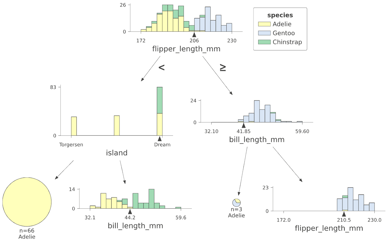 |
To make a prediction for a test penguin, this decision tree first tests the flipper_length_mm feature and if it’s less than 206, it descends to the left and then tests the island feature; otherwise, if the flipper length were >= 206, it would descend to the right and test the bill_length_mm feature. (Check out the tutorial for a description of the visualization elements.)
The code used to generate that tree is short. Given a classifier model called cmodel, we collect and wrap up all of the information about the data and model then ask dtreeviz to visualize the tree:
penguin_features = [f.name for f in cmodel.make_inspector().features()]
penguin_label = “species” # Name of the classification target label
viz_cmodel = dtreeviz.model(cmodel,
tree_index=3, # pick tree from forest
X_train=train_ds_pd[penguin_features],
y_train=train_ds_pd[penguin_label],
feature_names=penguin_features,
target_name=penguin_label,
class_names=classes)
viz_cmodel.view()
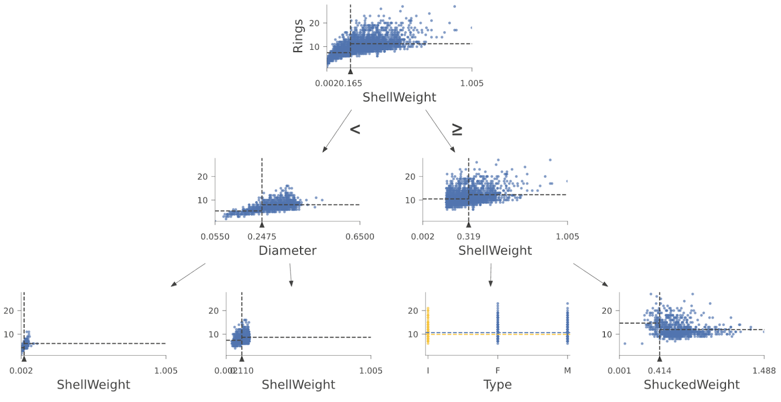
And here are the first few layers of a regressor tree from a Random Forest trained on the Abalone data set:
 |
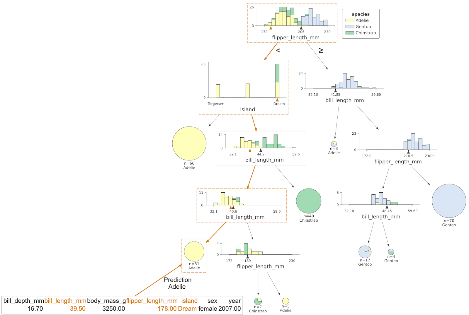
Another useful tool for interpretation is to visualize how a specific test instance (feature vector) weaves its way down the tree from the root to a specific leaf. By looking at the path taken by a decision tree when making a prediction, we learn why a test instance was classified in a particular way. We know which features are tested and against what range of values. Imagine being rejected for a bank loan. Looking at the decision tree could tell us exactly why we were rejected (e.g., credit score too low or debt to income ratio too high). Here’s an example showing the decisions made by the decision tree for a specific Penguin instance, with the path highlighted in orange boxes and the test instance features shown at the bottom left:
 |
You can also look at information about the leaf contents by calling viz_cmodel.ctree_leaf_distributions(). For example, here’s a plot showing the leaf ID versus samples-per-class for the Penguin dataset:
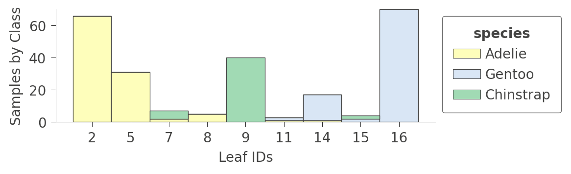 |
For regressors, the leaf plot shows the distribution of the target (predicted) variable for the instances in each leaf, such as in this plot from an Abalone decision tree:
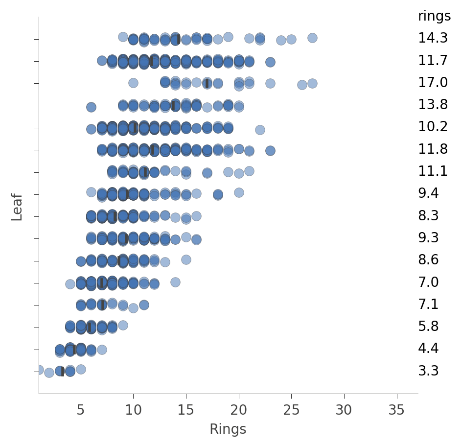 |
Each “row” in this plot represents a specific leaf and the blue dots indicate the distribution of the rings prediction values for instances associated with that leaf by the training process.
The library can do lots more; this is just a taste. Your next step is to check out the tutorial! Then, try dtreeviz on your own tree models. To dig deeper into how decision trees are built and how they carve up feature space to make predictions, you can watch the YouTube video or the article on the design of dtreeviz. Enjoy!


Responses